|
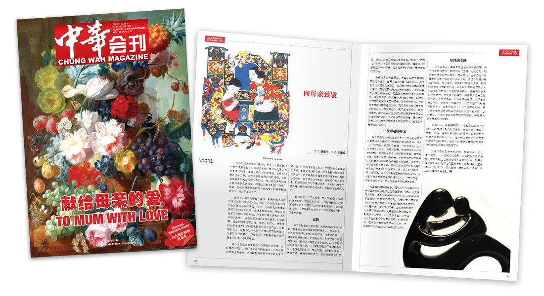
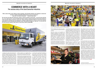
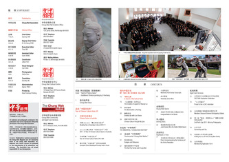
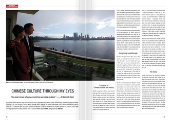
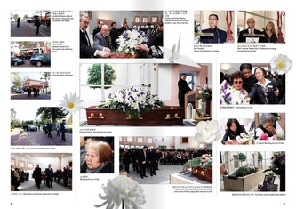
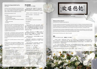
Chung Wah Magazine, Vol. 6 for MAY 2012 edition fresh off the press. The May issue paying special tribute to to all Mothers, in conjunction with the Mother's Day celebration.
0 Comments
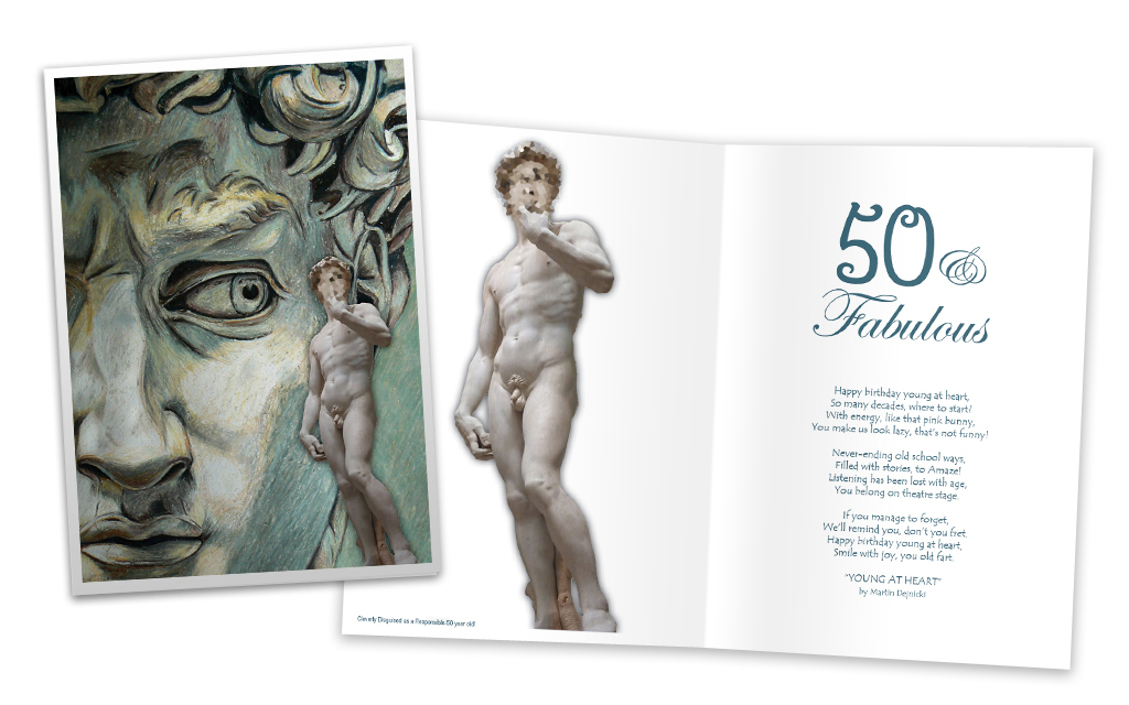
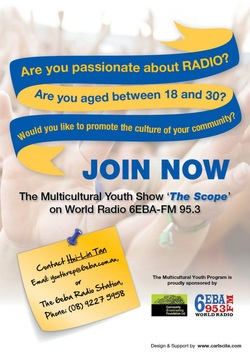 This flyer was created to recruit new broadcaster to volunteered for the World Radio 6EBA - FM95.3 Youth Program "The Scope". The design were simply based on the three question, which feature as the slogan for this recruitment advert piece. A blue-yellow ribbon is feature to attract the audiences attention, that leads to the "JOIN NOW" mentioned at the end of the ribbon. To match with the youth, a post-it note with a blue pin on it were feature on the bottom left corner, filled with the contact details for the position. All related logos and details is evenly place on the right bottom corner to balance the whole image out. A background of youth raising up their hands to answer the call is used to reaffirmed that it is a youth related piece. This job were relatively quick turn over, sponsoring them with my design flair. Another addition to my design portfolio. A quick Birthday Card for my best mate's birthday, based on graphic and text obtained from the internet.
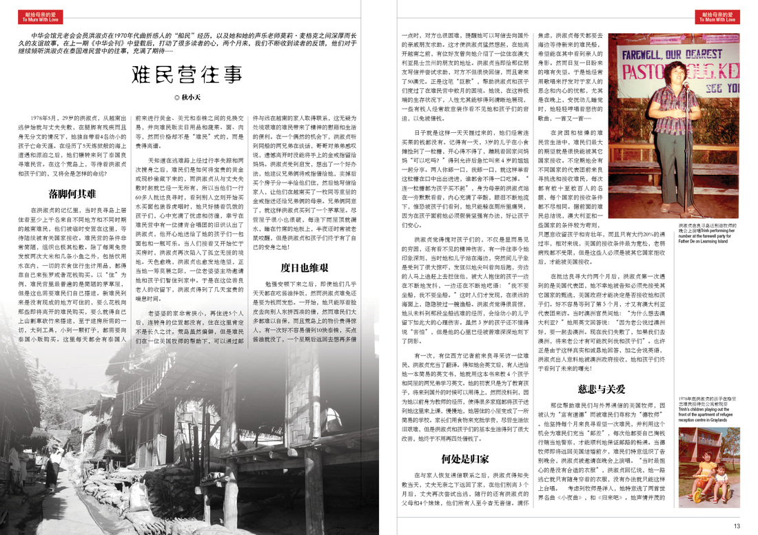
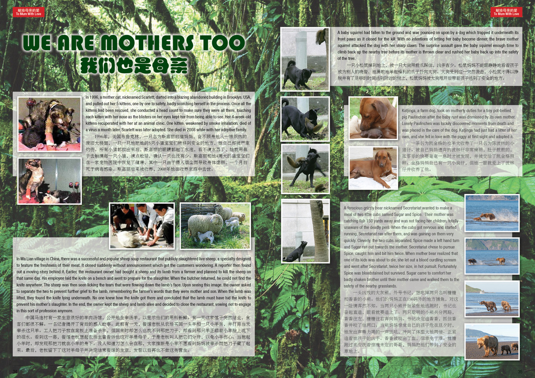
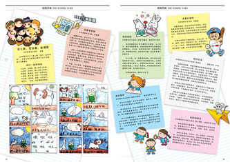
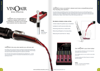
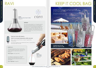
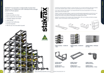
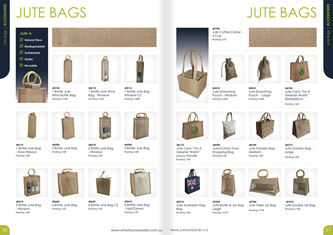
* All graphic copyright reserved to their creator, please contact me if that had been your work. Graphic Used: illustration "DAVID" obtain fronm Devianart, photography "David" from anonymous source. 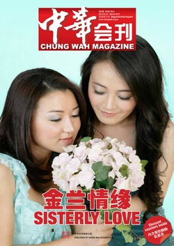 Another issue of ChungWah Magazine mark another milestone for my work with ChungWah association of Western Australia. This have been a really long journey I had been with them, since I got myself in since the second volume of this magazine. A lot of effort had been put into the design layout on this issue, with a large volume of content from the just passed Chinese New Year. A new layout is again proven works in the acceptance of the readers, which is continued to direct this magazine from a conventional text emphasis towards a more contemporary approach with modernised layout of text and images. The next issue (Volume 6) is now in cooking. Hopefully with no further delay it would be out soonest.  _Another issue of ChungWah Magazine that got done under my wings. This issue had been a success to promote the core service of ChungWah association – Age Care and Community Service. Many more new sections and columns were introduced in this issue, which had given me more areas to explore the layout variation. It is proven the quality of this magazine from the respond received from the readers, in terms of content and the quality of the magazine. There had been plans made to put forward this magazine from a members only subscription, to the general public whom can now purchase the next issue on news stand. This had been a great leap forward in terms of editorial and of course, more challenge for me to improve the visual design of the magazine. If you wish to take a peep of my work, you may download the copy of the magazine in PDF from here. The next issue will be release in January, packed with more information and visual design challenge that had been accomplished, so stay tuned.  _I had been lucky enough being appointed as the Visual Designer and translator of this magazine, working closely with the Chief Editor on this 80+ pages magazine for ChungWah Association of Western Australia. Of the leading ethnic based society that just had their centennial celebration last year. Potentially this magazine would reach to their members and general public of Perth, especially the Chinese community. It's indeed a challenging works to race with time, tasting the quick pace of a magazine production. Looking forward to the next issue with more challenging content to work on. The magazine is now available online in PDF form for download, please click here to view it. 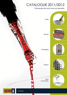 __This is a 28 pages catalogue design for a local company “WineX” – wholesaler for bar and wine accessories. The catalogue features a range of products that being categorised in various sections for ease of reading. The feature pages incorporated to demonstrate how a product function to engage more attention from its readers. Providing a break on its standard stock-list layout. The overall layout designed were given a lift from the earlier years work, and still in beat with the company's corporate style. The new product layout also in aim to engage attentions, not just only a ordering-list. You may have a quick peep of it’s PDF form from here. 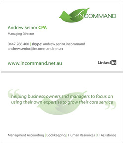 _Business card layout design for a mate, who recently just start his own business – “INCOMMAND”. The initial minimalist idea were implanted by the business owner, Mr. Andrew Seinor, and came in to put his idea into this production-ready files. It had been a great pleasure to work with Andrew for this quick turn-around job. 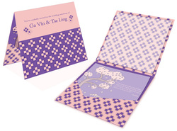 _Another self directed project to create a wedding and receiption invitation for a good mate’s wedding. The design were based on given information from the couple: their favourite color and intend graphic elements (the tree). The design had put forward to prepare for print, but due to the overseas printer constrain they have to take the pick from the given template. But afterall, it is still a good practice work to add into my portfolio collection. |
My Work
Here is the collection of my work examples for my portfolio. Please feel free to have a browse through the categories and feel free to comments on my work Categories
All
|
 RSS Feed